
Project Description
Project Brief
Power Financial Credit Union (PowerFi) had a wonderful culture of serving put in place by their executive leadership headed by CEO, Alan Prindle and their board. We worked with them to engage in a branding workshop so that we could define what their values were and help them discover their brand.
The results of the collaboration with them were amazing! Together we built a branding pyramid and messaging platform that revolved around the idea of Family. Family helping family. It was a wonderful sentiment that held affinity to all of their consumers, especially the majority Latino consumers of Southern Florida.
Over the next year we were worked to develop TV, Radio, Branch Collateral and Online Materials.
Television Anthem
Family Television Spots
Branded Collateral
Branding Pyramid
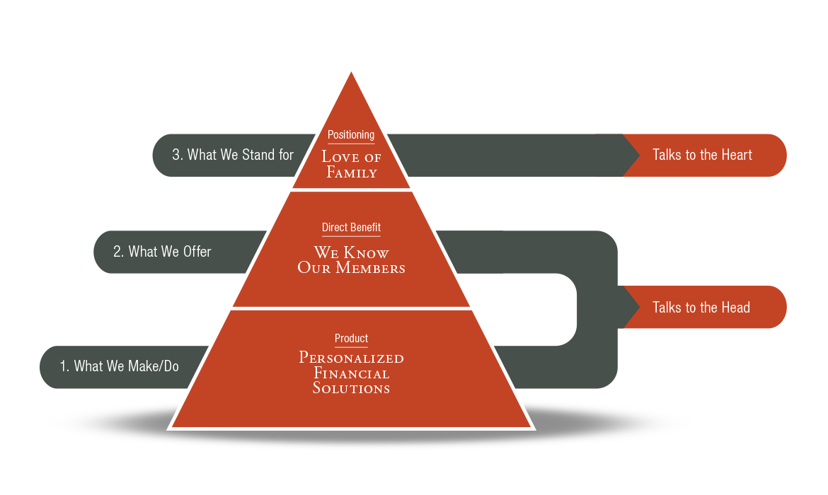
We met to collaborate with the leadership team at Power Financial Credit Union and conduct a Branding Workshop over the course of 3 days. The first 2 days were spent in a conference room determining their values and messaging platform. The third day was spent touring their locations and speaking to branch managers without the leadership accompanying us so we could gather input from as many sources as possible.
What resulted was a rich collection of information that we used to build into many communication channels. We agreed that PowerFi offered personalized financial solutions, the benefit being that members feel close and known to the institution. And what PowerFi stood for and would dedicate the most to communicating was the “Love of Family.”
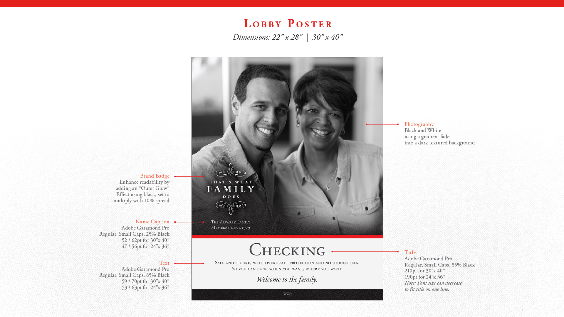
Black and White Photography
Photography captured the happy, warm emotions and everyday family togetherness of their members, families, and employees. With an absence of color, the black and white photography focuses on the family expressions more closely, which depict honesty, respect, and love, all in line with brand positioning: Love of Family.
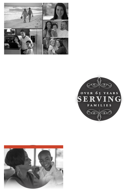
Family Badges
Badge messaging is an aspect of PowerFi brand positioning, Love of Family, who they are as professionals, and what drives them. The badge is a short but very simple statement that PowerFi wants their audience to take with them and tell others. It is a ‘viral’ message they own, and one they wear and voice proudly.
Red Accent
PowerFi uses a rich red color in it’s logo and we decided to incorporate that into the branding and collateral as an accent to provide an energy to the pieces in small, well seasoned ways to punctuate the design. This is reminiscent of the classy, Art Deco feel that Southern Florida is so well known for.
Strong Brands
Love of Family is a powerful value and we’re proud of the work we did together with Power Financial Credit Union. They now have a strong brand that they can promote for years to come to the community that will resonate with the large Latino population they serve.
Results Require Consistency
It was a great year working with PowerFi. A key to success is a commitment to dedicating adequate resources to keep your communication channels filled with content. Especially when a new brand is developed and implemented where none existed before.